Honest challenges and hope

28 02 2009
Image courtesy of John Hyatt http://johnhyattillustration.com

Image courtesy of John Hyatt http://johnhyattillustration.com

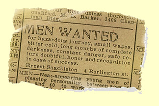
The advert above is often applauded as a successful advert. It is said that it generated over 5,000 applications for Shackleton’s adventure.

I learnt today that the advert may actually be a fake. Not just the illustration above which is of course fake (the English spelling of ‘honor’ is honour) but in fact that Shackleton may have placed an advert something more akin to:

“Hands wanted for long voyage in small boat. No pay, no prospects, not much pleasure.”

What the fake and the probable original share is raw honesty. Whilst none of us would suggest that charity marketing is full of lies. We should not neglect to tell our supporters exactly what the situation is. For example, if no breakthroughs have been made, we should explain why. Furthermore if we cannot explain why our service works, then we’re clearly not ready to be trusted with people’s money.

What the fake does offer though is hope. It presents the harsh challenge alongside the possible glorious outcome.

Honest challenges and hope – two more ingredients for successful fundraising communications.


Should you give your ‘regular givers’ a name?

26 01 2009

photo483

I’m often asked whether charities should spend time developing product or campaign names. I believe that the answer is often to consider whether it is a trick question or not!

The question above is of course, a trick question.

If you are going to remember, recognise, and value the support of ‘regular givers’ you are going to need to acknowledge their act of regular giving, and probably their status as a ‘regular giver’.

So… rather than use a piece of unfriendly, generic jargon such as ‘regular giver’ to personalize your communication.. why not spend a little time developing a unique name for them.

Here are some examples… if you would like more details of why I have grouped them the way I have, ask me for my opinionaid!

Group 1: Futuremakers, Full Stop supporter
Group 2: Field Partners, Discovery Partners, Frontline Member, Friend of PAWS, Golden Hearts supporter
Group 3: Human Rights Defenders, Frontline Member, Child Sponsor, Heart Saver, Kennel Sponsor


A lesson from bears

10 01 2009

images1

I am attempting to read several books at the same time. I get over excited when I get books for Christmas, try and start them all, and then find myself wrangling over which deserves gets my full attention.

It always gets me thinking about the direct mail letters that charities send out. People like to read… so how do we ensure that they feel compelled to give the letter more of their attention than the cereal packet, paper or blog?

I had only moved maybe twenty feet when she saw me, let out a most electrifying vocalization that I could only call a ‘roar’, and she bolted after me. I can still see her clearing the log in as much detail as if it were yesterday. I began to run for the heavy timber but after a few steps, realized it was futile. The choice was then to get knocked down or lie down myself and play dead.

Do I have your attention?

Using first-hand testimonials is a great way to capture attention. And better still by italicizing it, you draw the reader’s eye to it.

‘Bear Attacks… their causes and avoidance’ by Stephen Herrero grabbed me that way.


Does it really matter if you don’t indent your paragraphs when writing to supporters?

7 04 2008

Probably the most important consideration when writing to supporters is to think about what they think, not what you think.

The majority of things that people choose to read in print still carry indented paragraphs. Take a look in books, newspapers, even many magazines… they still use indenting to signal a new thread within the prose.

Take a look at most of the adverts that designers have gotten their hands on, and you’ll see that indenting is cast aside as something quite old fashioned.

So try putting these two observations and then judging whether you think indenting paragraphs is appropriate for your audience.

The image above is taken from the best advert of all time… indents and all.